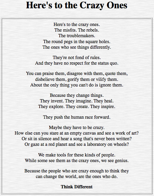
I first saw the poster in the local Apple store, and I fell in love with it instantly!
It reminds me of Outliers, by Malcolm Gladwell.
Despite of being called genius, crazy ones, outliers…, these are individuals who are committed, engaged, and possess a great amount of perseverance! They don’t follow the status quo, they don’t follow the norm. But, they make a difference!
How would I make a difference…? By communicating effectively… via visual communication!
Design, to me, used to be an intuition,… at a moment,…. spontaneous. I knew I was missing something, but what?
St. Clair’s explanation of Visual Grammar and Visual Principles showed me a new perspective in understanding design. The Visual Space actually has its organization!
The discussion on the left and right hemispheres (note 2) helped me understand why left-brain dominant people sometimes have such difficulties understand the right-brain counterparts.
Gestalt claimed that human beings have the natural ability to organize images based on similarity, proximity and others. And mostly the interpretation can be drawn from personal experience and familiarity.
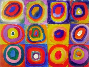
With these in mind, I am starting to see my surroundings differently now. To start off, my two favorite artists immediately came into focus, Kandinsky (1866-1944) and Mondrian (1872-1944). Their compositions portray a series of emphasis on colors, patterns, repetition, balance, …..
Kandinsky was also an accomplished musician, he used color in a highly theoretical way associating hue with pitch, and saturation with the volume of sound. He even claimed that when he saw color he heard music.
Mondrian believed it is possible that, through horizontal and vertical lines constructed with awareness, but not with calculation, led by high intuition, and brought to harmony and rhythm, these basic forms of beauty, supplemented if necessary by other direct lines or curves, can become a work of art.]
In the same timeframe, Frank Lloyd Wright (1867-1959) also playfully employed straight lines and colors into his works.
As a teacher of the Chinese Language, I am more reminded of Gardner’s Multiple Intelligences which suggested the natural intelligence of each individual determines how one best learns. It is critically important that my instructional design includes the variety of visual principles to aid my visual communication with the students. Particularly when it comes to explaining the etymology of the characters, I must draw their attention to the visual elements of each characters. Design, as Daniel Pink puts it, is utility enhanced by significance! … and I’ll be on my way to change the world!
The following two video clips explain the significance of understanding the etymology of characters for anyone who may be interested to know a little about Chinese characters.
Footnotes
Note 1: St. Clair explained that Visual Grammar distinguishes dot, line, shape, space, color, texture, value and form, and these elements are further arranged into Visual Principles of Unity/Harmony, Variety, Balance, Emphasis, Rhythm, Movement, Pattern, Graduaion and Proportion. Visual thinking is spatial thinking. Bicognitive refers to the ability in visual thinking as well as linear thinking. Arnheim noted that artistic expression is a form of reasoning.
Note 2: The left hemisphere is specialized for linear thinking, logic and analytical abilities. The right hemisphere is involved with concrete thinking, processing of spatial patterns relations and transformations. It appreciate the complexity in complex sounds, music, voices and tones, and face recognition. The right hemisphere is the imaginative and creative part of the brain.


Joanne, what a connection you have made between the principles of design, the multiple intelligences, and your teaching! I do not know Chinese, but have taught my students how to paint some Chinese characters for a calligraphy lesson. Your new understanding of emphasizing the visual elements of the characters to teach is probably the way I knew best how to to communicate with my own students. Our difference in backgrounds and teaching goals is clear yet the method for teaching has the potential to unbelievably similar. Of course, I brushed upon a small history attached to the characters and shared as much as I felt comfortable with my own knowledge of calligraphy.
Back to your post…I am amazed that the St. Clair reading was so helpful to you. I found it to be visually distressful and as Jenn suggested quite the opposite of what an article about visual communication should be. Perhaps you are a very complex thinker, more than I cared to be when I was reading it. I also think my K-12 teaching of art terms, vocabulary, and concepts has been so simplified that I found the reading much more complicated than it had to be_though it had some good points. Nevertheless, I am glad that St. Clair was able to increase your design perception and confidence, especially in regards to your future teaching. I hope that you continue to grow in your understanding of the environment from a design perspective, too.
Especially interesting is the selection of images you chose to demonstrate your understanding of the design principles (assignment says elements of design). All of those geometric compositions make me think that you like order and organization! IF I was your Art teacher grading your submission of these images, I would ask you to provide more of a literal description of how the images represent the principles you labeled them as. Without knowing what the terms mean already, I would find it hard to understand how to create the principles of design in my own work. For thought/example, how would someone else be able to create proportion visually with the description you provided for the Mondrian piece? What you provided a lot of were artist interpretations. How would I know as your instructor that you really understand the principles of design? Of course, I believe that you are just getting acquainted with design and would not expect an experienced artist’s answer. This is just something to think about as you work on your design project for this class if you haven’t already completed it! =^)
Excellent questions!!
If you were my Visual Arts teacher, I would have failed your class miserably!! //_o\
I guess I am still operating at my very primitive ‘intuition’ mostly, although am learning to look for the science behind the designs.
I was in love with the selected compositions before I knew the artists’ names, and I had no idea what they had in mind when they created them.
But you raised an interesting question, so can one not enjoy an artwork if one cannot articulate the design principles behinds it?
I also appreciate Monet’s Water Lilies but I cannot tell you a thing about impressionism. I was standing within 3 inches admiring it once, and it just ridiculously moved me to tears. How important is it to ‘understand’ a piece of art for us to enjoy it? and will it speak to me more if I can ‘explain’ it?
I used to think it doesn’t matter, but I guess I am wrong…?!!
Wait…, what happened to ‘a picture is worth a thousand words’?…. Just kidding.. ! ♪(´▽`)
I should have checked that box to get notified…just seeing this! Thanks for your response. Before I say anything, I would not have let you fail if you were my student because I was a mastery-oriented teacher. Besides, we are in a completely different educational setting and this is not the introductory Visual Art I where I would have hypothetically taught you. He he he. =^)
In reference to my questions, they were not connected to any personal enjoyment only to your understanding of what you were analyzing. One can certainly enjoy artwork intuitively as you shared, but all people can appreciate imagery more with design knowledge (including the historical and social aspects). The terms we learn came after the discoveries and it is those who practiced art making that gave us words to reference. People who do not make art regularly or have little background knowledge especially benefit from comprehending their explanations.
Also, it is entirely possible that your perception of a composition you once loved can become something you hate with design understanding. Something you previously ignored visually could suddenly pique your interest. I would conclude by saying that knowing more about design could only enhance one’s experience with art. Remember, I am ONE Art teacher out of many and these are only MY glorified thoughts…but I would take my own advice. 😉 He he he!
Joanne,
Your videos that you included in your post were enlightening, I never knew that the characters were actually meant to be symbols or pictures. Because I was so unfamiliar with them, I thought that they were random assorted lines. I really appreciate you finding these videos and sharing them. It shows how different languages like English and Chinese really are. I wonder how that difference happened? How many Chinese characters are there?
Thank you! I’m glad you enjoyed the videos.
Believe it or not, no one actually knows how many Chinese characters there are ….. >.< !!
But for daily common use, there are 3500~4000. i.e. a fairly educated person who can pick up a newspaper and read.
Yes, the characters have meanings. Some goes back to 5000 years ago. It is the oldest ancient language that is still in use today.
Yet, new characters continue to surface as well. It is quite fun to learn the etymology of the characters.
I’m so impressed that St. Clair’s paper succeeded in raising your awareness of design to a whole new level, Joanne. As stuffy and visually unappealing as it is (it is published in a academic journal and design loses out to perceived practical transmission of content), you were struck by the organization and thought processes that go on behind the process of design. And then like a little kid with a new toy, you skipped about to see where you could apply what you learned. I love that you chose your favorite art to analyze for design elements. This post became a chance for you to explore and think out loud — which made it so much fun to read. And when you applied what you learned to your teaching — from theory to practice — you also taught us a lot about the symbolic nature of Chinese characters and how similar teaching language can be to teaching art (I had no idea — thanks to Preference for the insight).
You are changing the world by how you design your instruction and I hope you’ll come to see that teaching is much like design — often what seems so natural and simple is the result of incredible planning and organization.
I loved learning that Kandinsky said that he could see colors in music. Do you suppose that he had a touch of synthesthia? Have you ever heard of this condition? http://www.nytimes.com/2007/12/25/health/25brai.html?_r=0
What an interesting thought…. synthesthia!!
That poor woman in the article went from one sensory cross-wired to another.
I can’t imagine how she manages not to go insane!
If what Kandinsky had was synthesthia, then I guess synthesthia may present itself as
either a blessing or a curse. And what Kandinsky had was … I think, a blessing.
I wonder if this phenomenon is actually related to
Sensory Integration Dysfunction which some researchers suspected that it has something to do
with lacking certain exposures during some developmental phase(s).
Do I have a small dose of synthesthia? Every time I see/hear the word ‘rhythm’, I hear music!!
😀 !!